Healing Site
Type: Commissioned
Program: Scenography
Client: Nieuwe Instituut – Prix de Rome
Size:100 m2
Location: Rotterdam, The Netherlands
Status: Completed
Team: Zico Lopes, Carla Costa, Latisha Faasen & Joanna Peters
Exhibition Builder:Landstra Ontwerp en Uitvoering
Production: Lotte de Vries & Tijn van Wijdeven
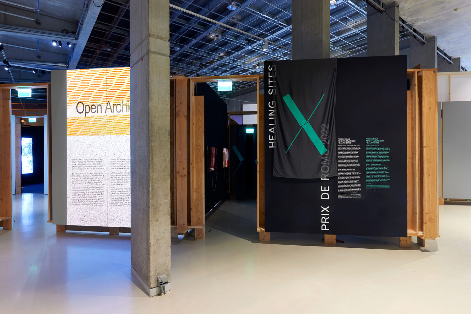
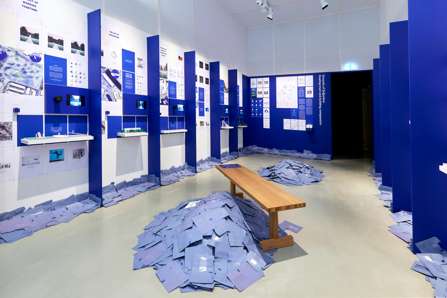
“Healing Site” is an innovative project that aimed to explore and bridge the diverse perspectives on healing by creating a unique exhibition space. Our team envisioned a cohesive experience that harmoniously combined four distinct approaches to healing within a captivating environment.
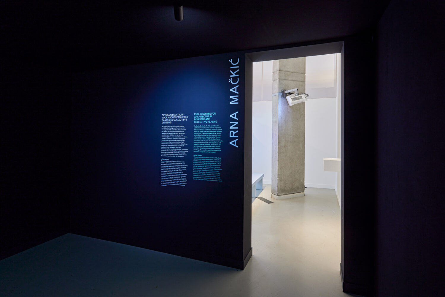
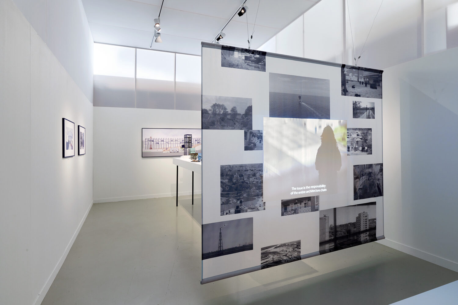
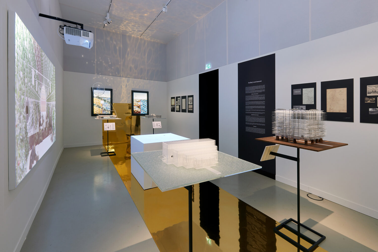
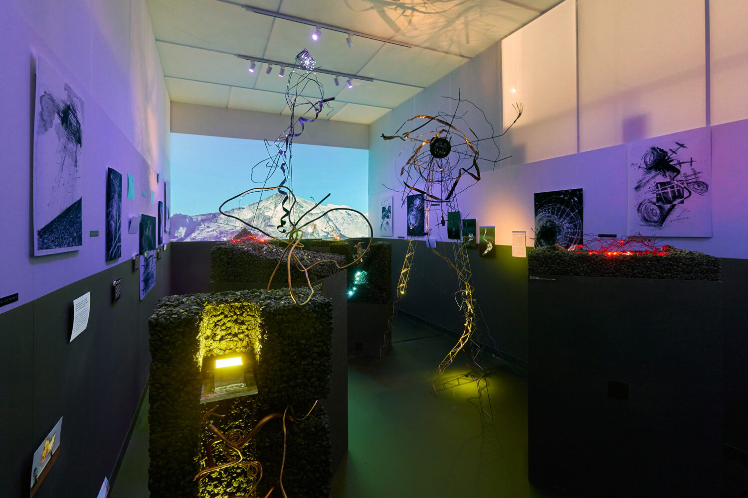
The exhibition consisted of four high white gallery cubes, each representing a different take on healing. These cubes served as individual rooms, each dedicated to showcasing a specific aspect of healing. Four finalist of the Prix de Rome competition carefully curated the content and design of each cube to offer visitors a comprehensive understanding of various healing practices and philosophies.
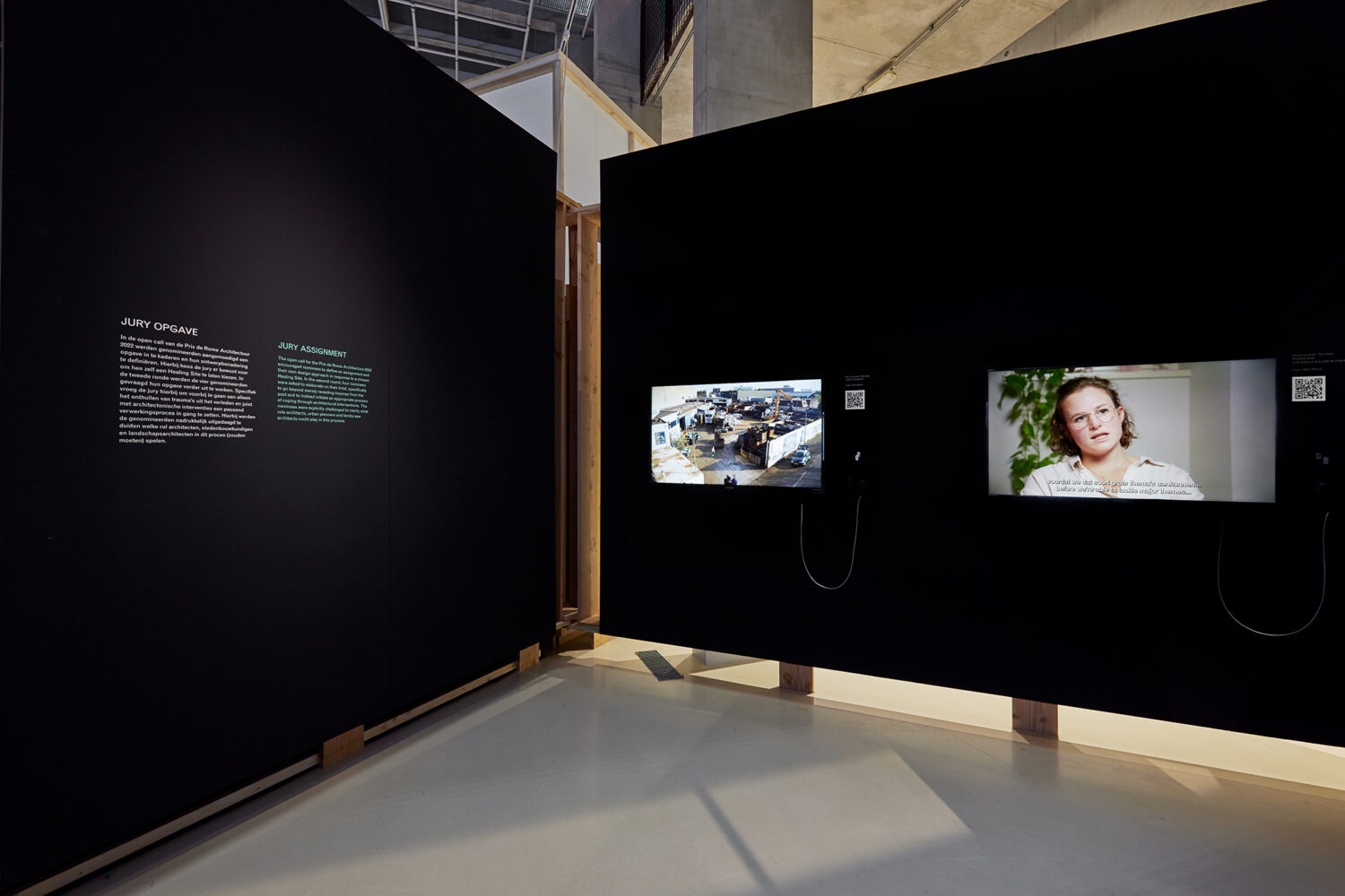
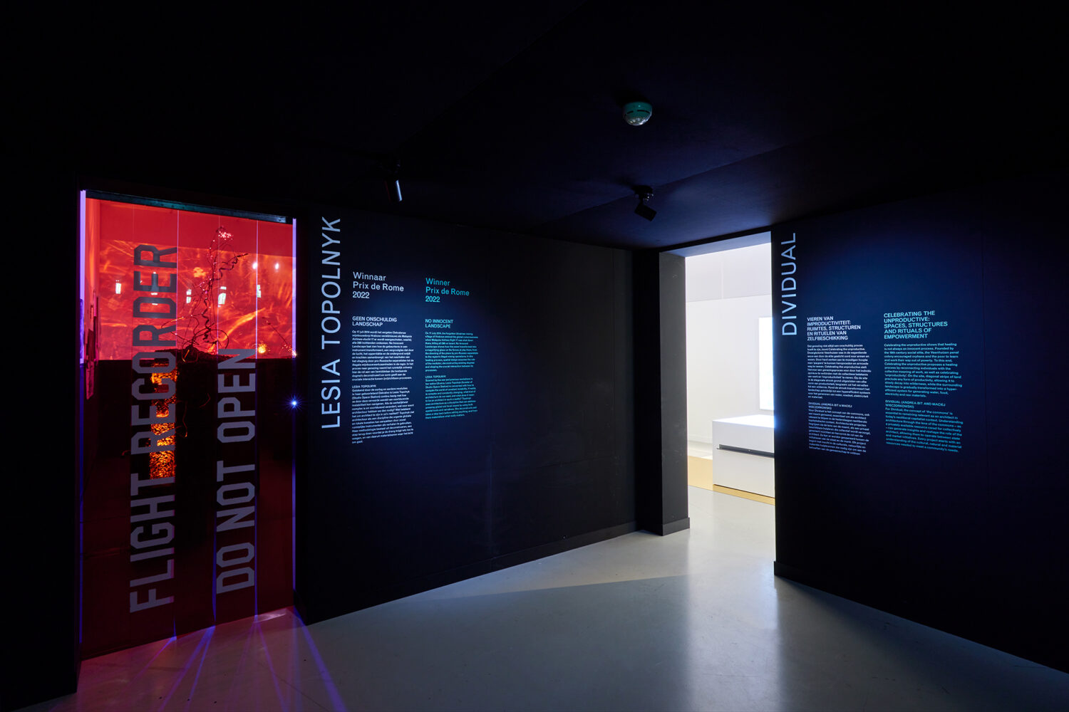
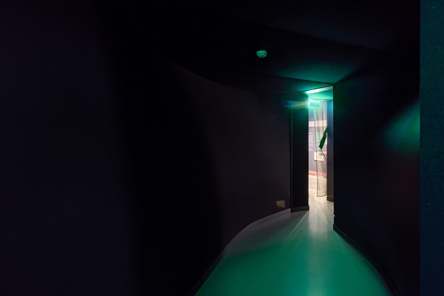
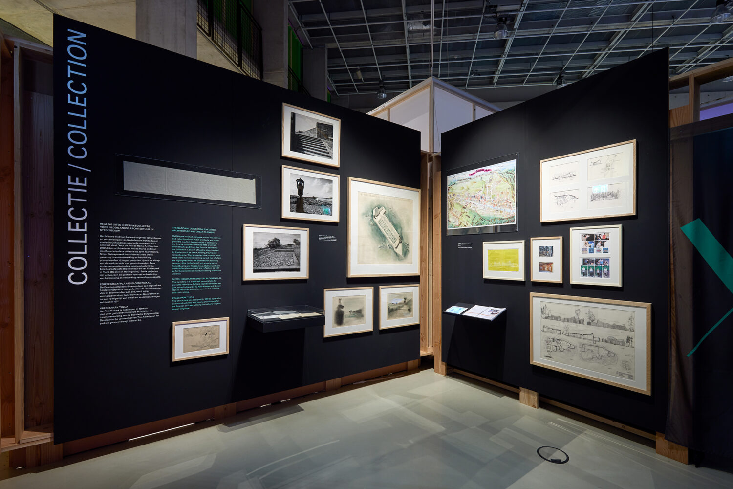
To connect these separate rooms and provide a sense of unity, we introduced the concept of a “void.” This lower black space, adorned with a soft fabric texture, acted as a transitional area. It allowed visitors to transition smoothly between the four rooms and offered a contemplative space for reflection and introspection.
The choice of white for the gallery cubes symbolized purity, clarity, and openness—characteristics often associated with healing. The high white walls and minimalistic design allowed the focus to remain on the curated content and the experiences within each room.
Contrasting with the bright and pristine cubes, the lower black void embodied a sense of mystery and depth. The incorporation of soft fabric texture added a tactile element to the space, inviting visitors to engage with their senses and create a more immersive experience.
“Healing Site” successfully integrated the four rooms and the void, seamlessly merging different healing perspectives into a unified exhibition. The juxtaposition of the white gallery cubes and the black void created a visually striking contrast, enhancing the overall ambiance and highlighting the significance of the project’s concept.
Visitors to the exhibition were encouraged to explore each room individually, immersing themselves in the unique atmosphere and absorbing the information presented. As they moved through the void, they experienced a subtle shift in ambiance, transitioning between the various healing perspectives and allowing for personal reflection.
“Healing Site” aimed to inspire visitors to reflect on their own understanding of healing and embrace the diversity of approaches in our world. By providing an inclusive space that showcased multiple perspectives, our project fostered dialogue, empathy, and an appreciation for the different ways healing can be pursued.
Overall, “Healing Site” successfully realized its goal of creating a captivating exhibition that connected four different takes on healing. Through the innovative design of the high white gallery cubes and the lower black void with soft fabric texture, we established a harmonious environment that stimulated exploration, contemplation, and a deeper understanding of healing practices.

